Upgrading a Brand’s Website & eCommerce Capabilities

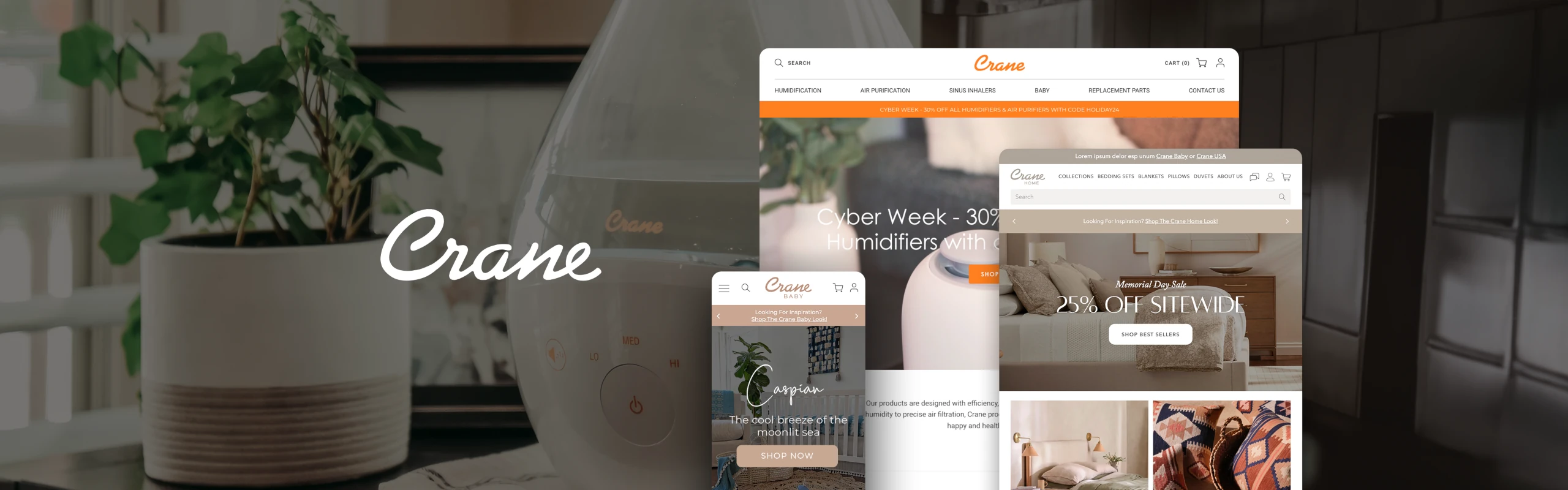
The website’s dated visual design no longer reflected the brand’s modern aesthetic or premium product positioning.
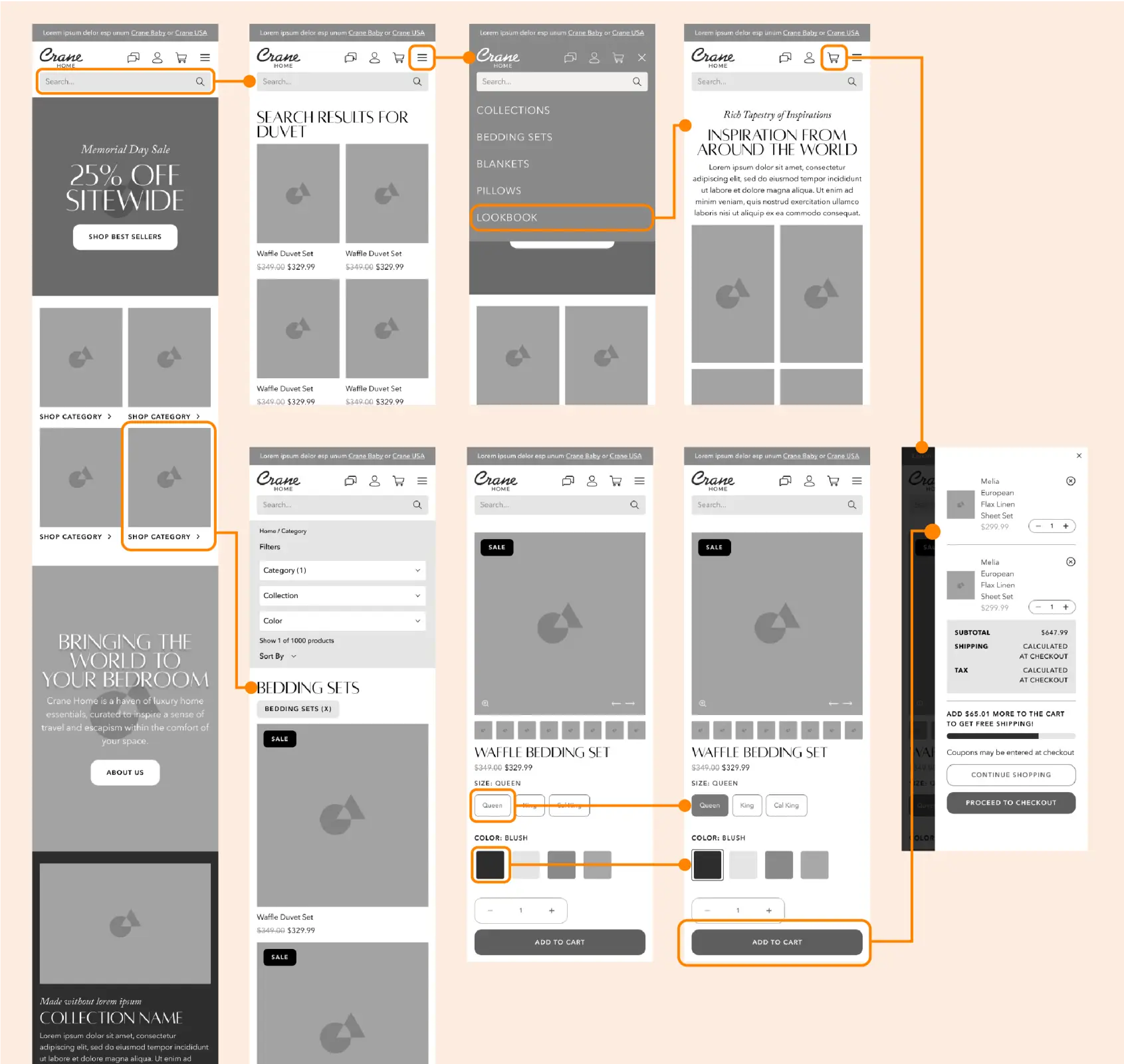
Cumbersome navigation and a clunky checkout flow created friction for users and contributed to elevated cart abandonment rates.
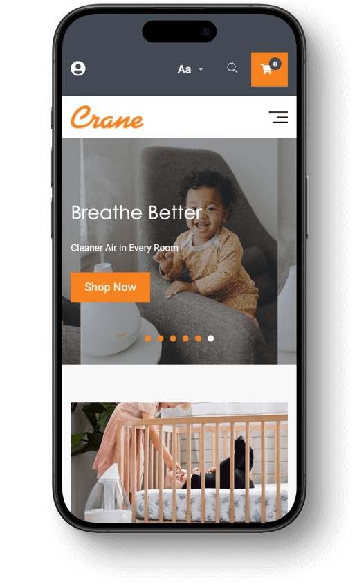
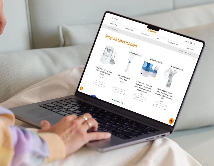
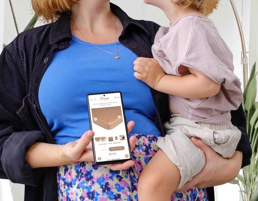
The site lacked full mobile optimization, resulting in inconsistent performance and a diminished shopping experience on smartphones and tablets.
Slow load times and SEO gaps limited the site’s organic reach and made it harder for customers to discover the brand online.

We examined the competitive landscape to identify ecommerce trends and design strategies in the wellness and nursery space.

We reviewed site analytics to pinpoint user pain points, content gaps, and performance drop-offs across the site’s key pages.

We defined clear goals around visual design, mobile performance, and streamlining the customer journey from browsing to checkout.

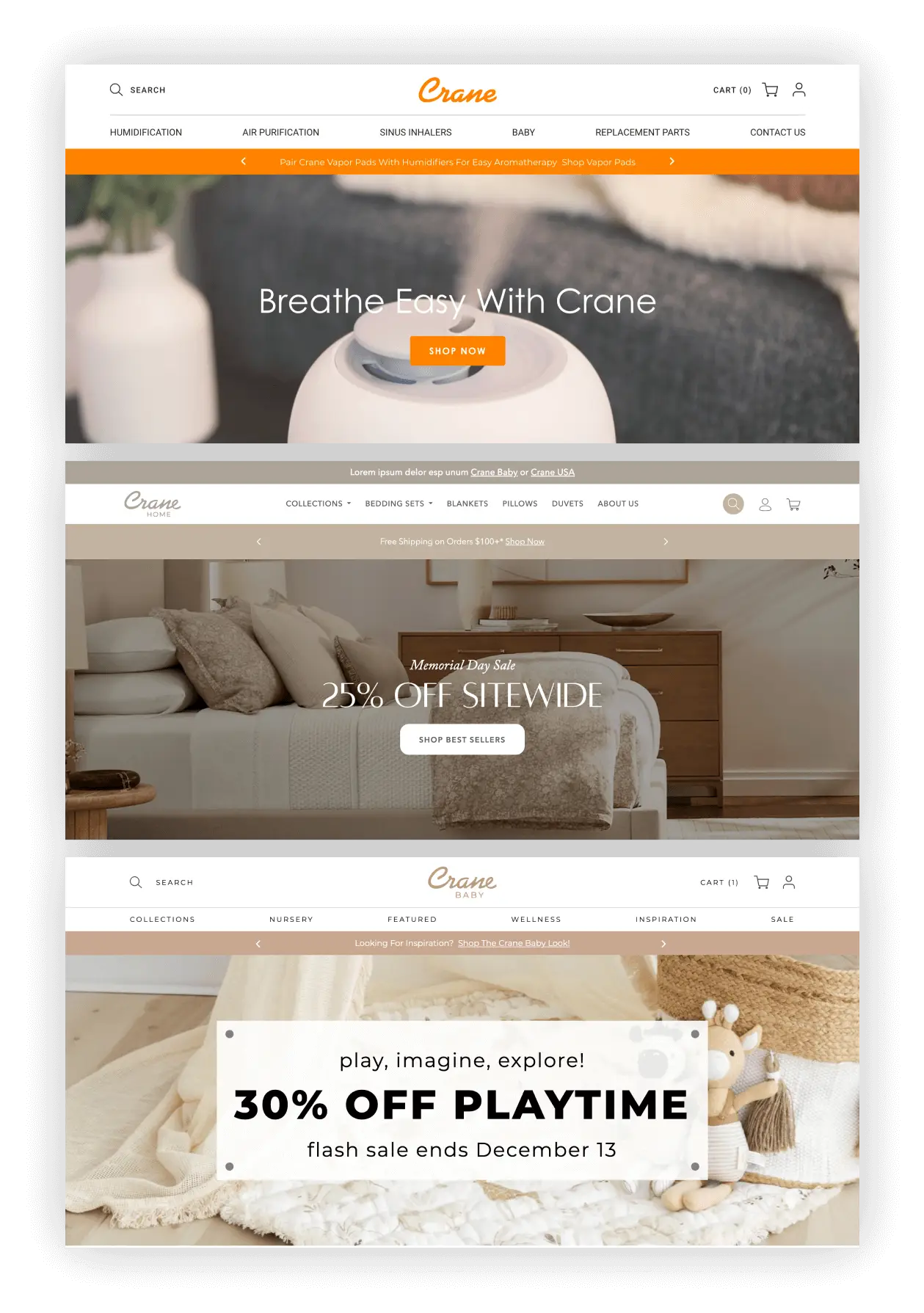
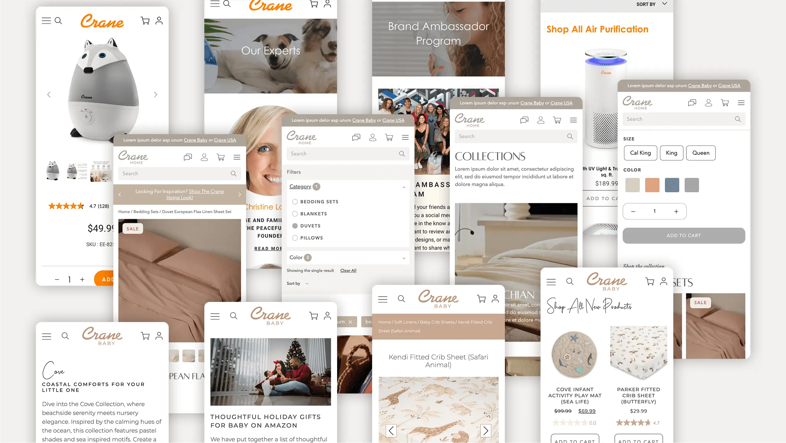
We restructured the site’s navigation to improve usability, showcase key content, and support multiple product categories.
Wireframing and Prototyping
We developed wireframes and prototypes to visualize the new site layout, streamline navigation, and map out the user journey.
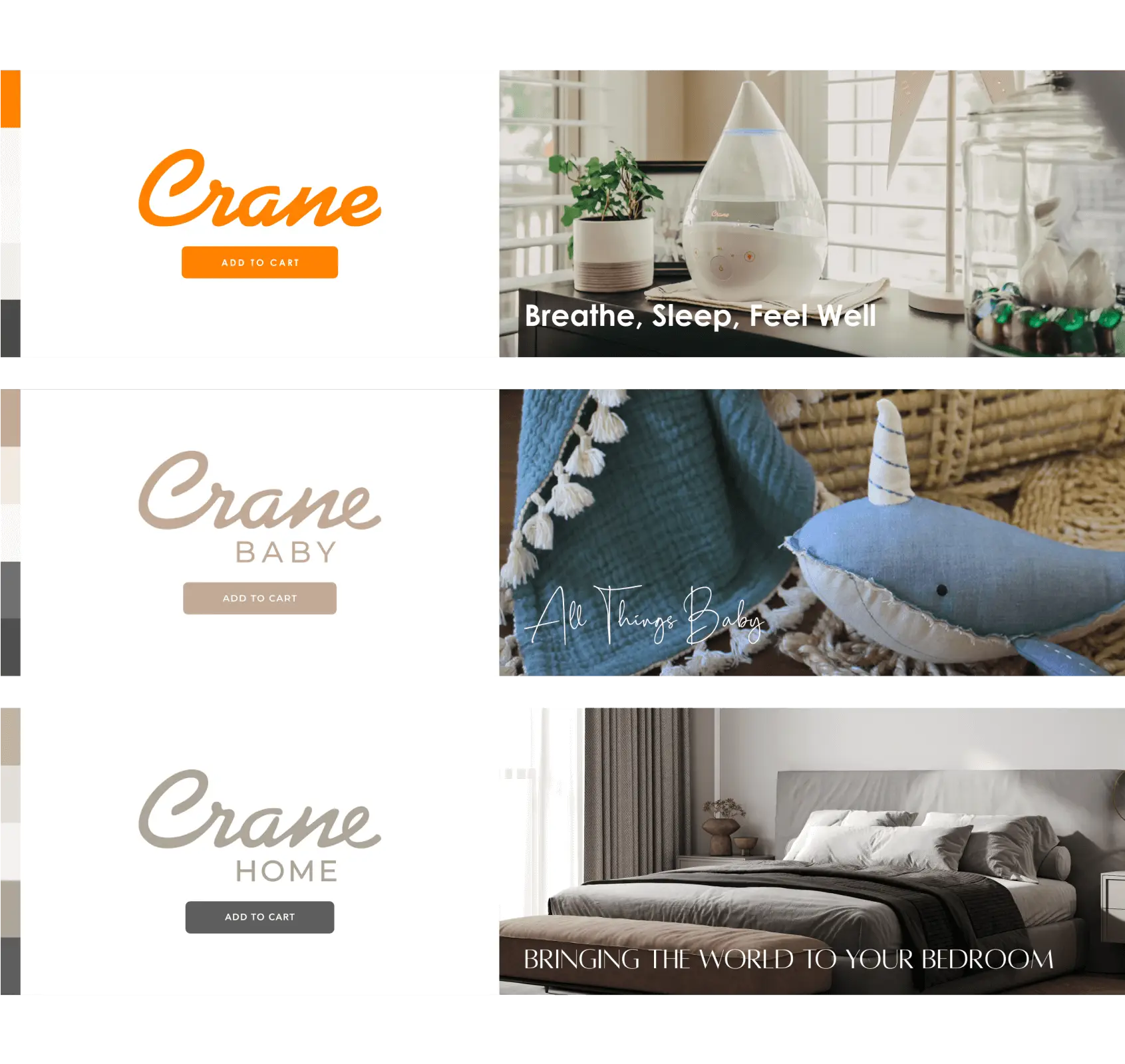
Brand Consistency
We crafted a cohesive, visually appealing design system that ensures brand alignment and continuity across all sites.
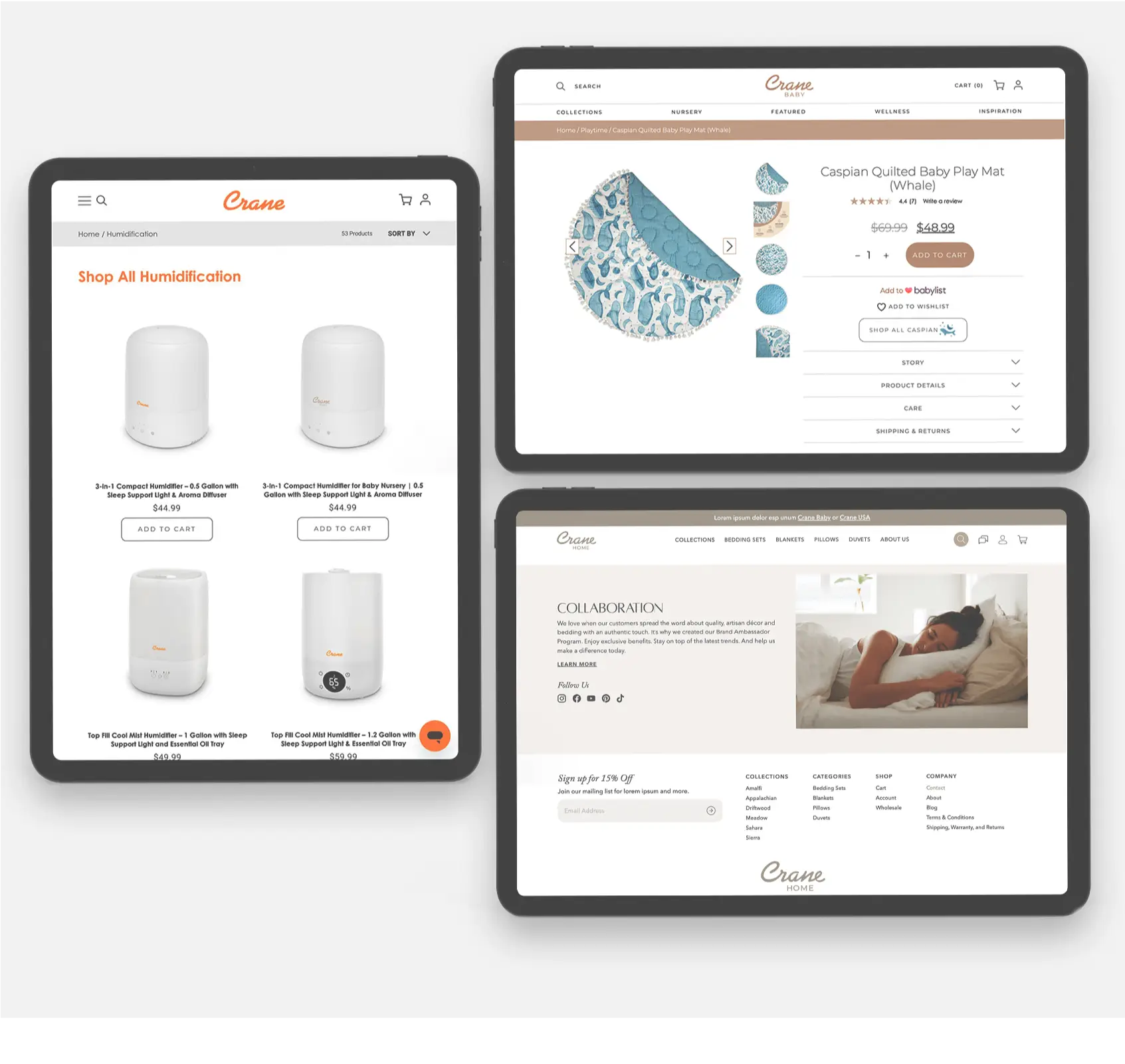
Mobile Optimization
We ensured the design was fully responsive and optimized for a seamless experience across devices of all sizes.
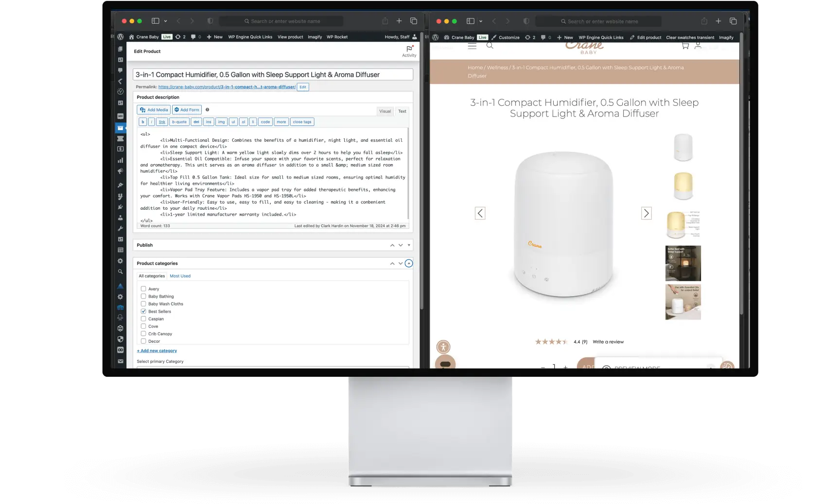
Platform Selection
We chose WordPress Woocommerce as the ecommerce platform, as it is both scalable and customizable.
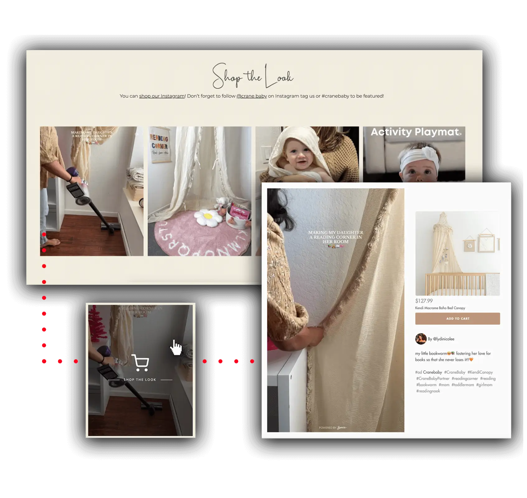
“Shop the Look” Feed
We installed a dynamic feed directly from Instagram, featuring fully shoppable products that update in real time.
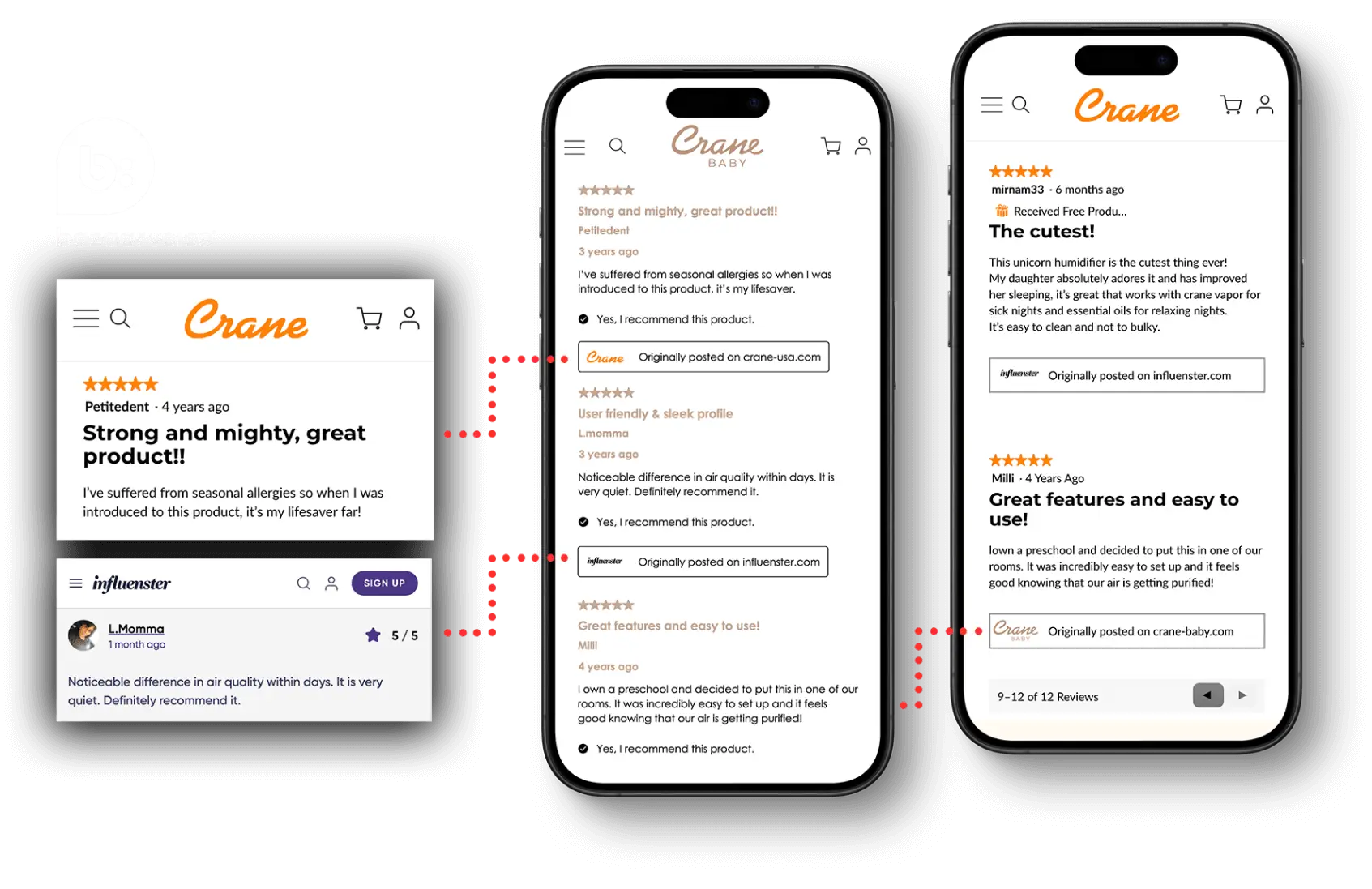
Embedded Reviews
We incorporated external review feeds to display product reviews from platforms like Amazon directly on product pages.

We conducted comprehensive testing across devices and browsers to ensure the site was user-friendly and free of technical issues.

We optimized the site for fast load times, smooth navigation, and reliable, high-quality performance across all devices and screen sizes.

We launched the site and closely monitored its live performance to quickly identify and resolve any issues following launch.

The site now features intuitive navigation across all devices and a simplified checkout flow, yielding reduced cart abandonment and improved conversions.
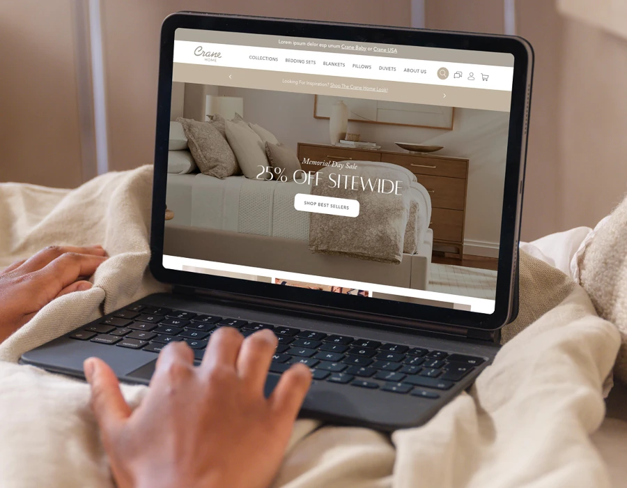
We delivered a clean, modern design that aligns with the brand’s elevated positioning and contributes to stronger user engagement and visual consistency.
We optimized load speeds and overall performance to deliver a smoother user experience, higher site visitor satisfaction, and improved search engine visibility.
We introduced a more effective product presentation and a frictionless checkout process, resulting in a notable increase in online sales and conversions.
We applied SEO best practices across the site’s architecture, metadata, and content to boost visibility, improve rankings, and drive search engine traffic.
We built the site on a flexible, easy-to-manage platform, enabling the brand to make quick updates and scale confidently as the business continues to grow.
The Final Result
Crane now benefits from stronger ecommerce performance, increased conversions, and improved customer engagement across all three of its brand sites, thanks to the multi-site redesign project completed by Zealth Digital Marketing. While the original site was outdated, difficult to navigate, and lacked mobile optimization, all three of the brand’s new sites now feature a clean, user-friendly design, are fully responsive across all devices, and are already supporting Crane’s ongoing expansion into adjacent categories.